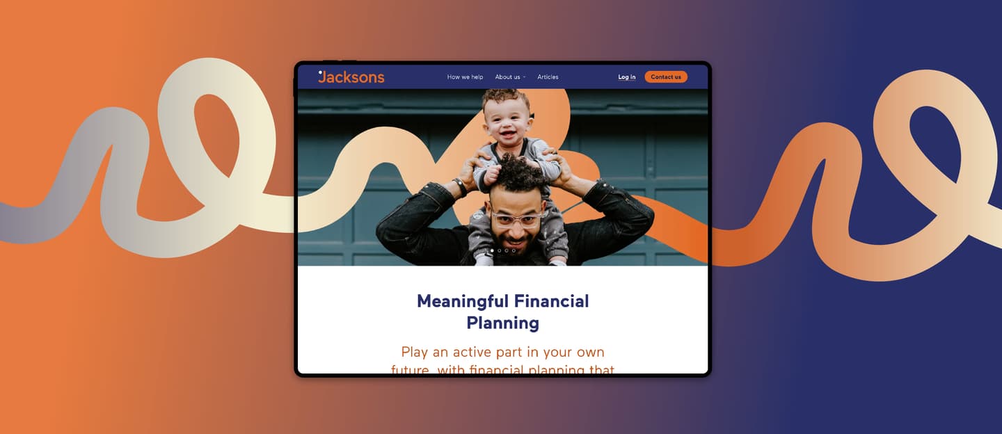
If you’ve visited us before, I’m sure you’ll agree that the new site represents a sea-change from the old one. And we’re all very glad about that!
We’re launching the new brand and the new website on the same day (because we’re overachievers like that) and I reckon that it would be useful to write about how we got to this point.
Choosing a partner
We briefly considered whether we could do this ourselves. Some of us here have an artistic streak, but it soon became clear that we wanted a complete refresh, different to anything that had gone before. As we’re immersed in the world of financial planning, there was just too much risk that we would revert to the same old tropes that (nearly) every other finance website features, like a compass, a lighthouse or a white middle-aged couple in deckchairs on a deserted beach.
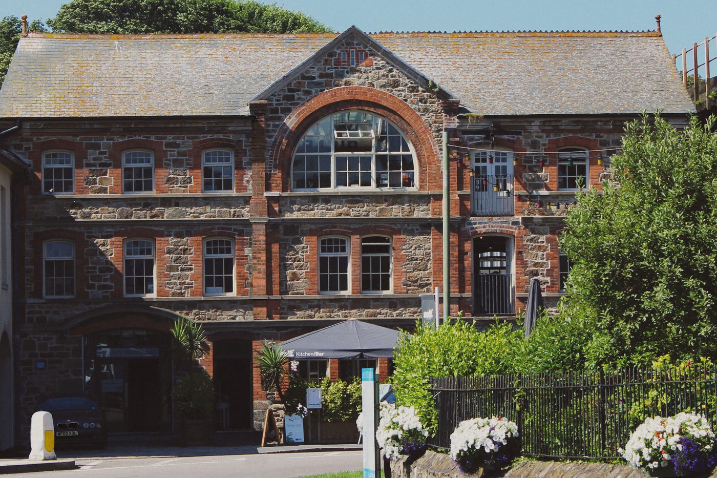
So we considered a few candidates and landed on the excellent Nixon Design, just six miles down the road from us in Hayle, Cornwall.
The clincher was that Nixon had never worked on a financial sector brand before, and that objectivity was what we needed.
The process
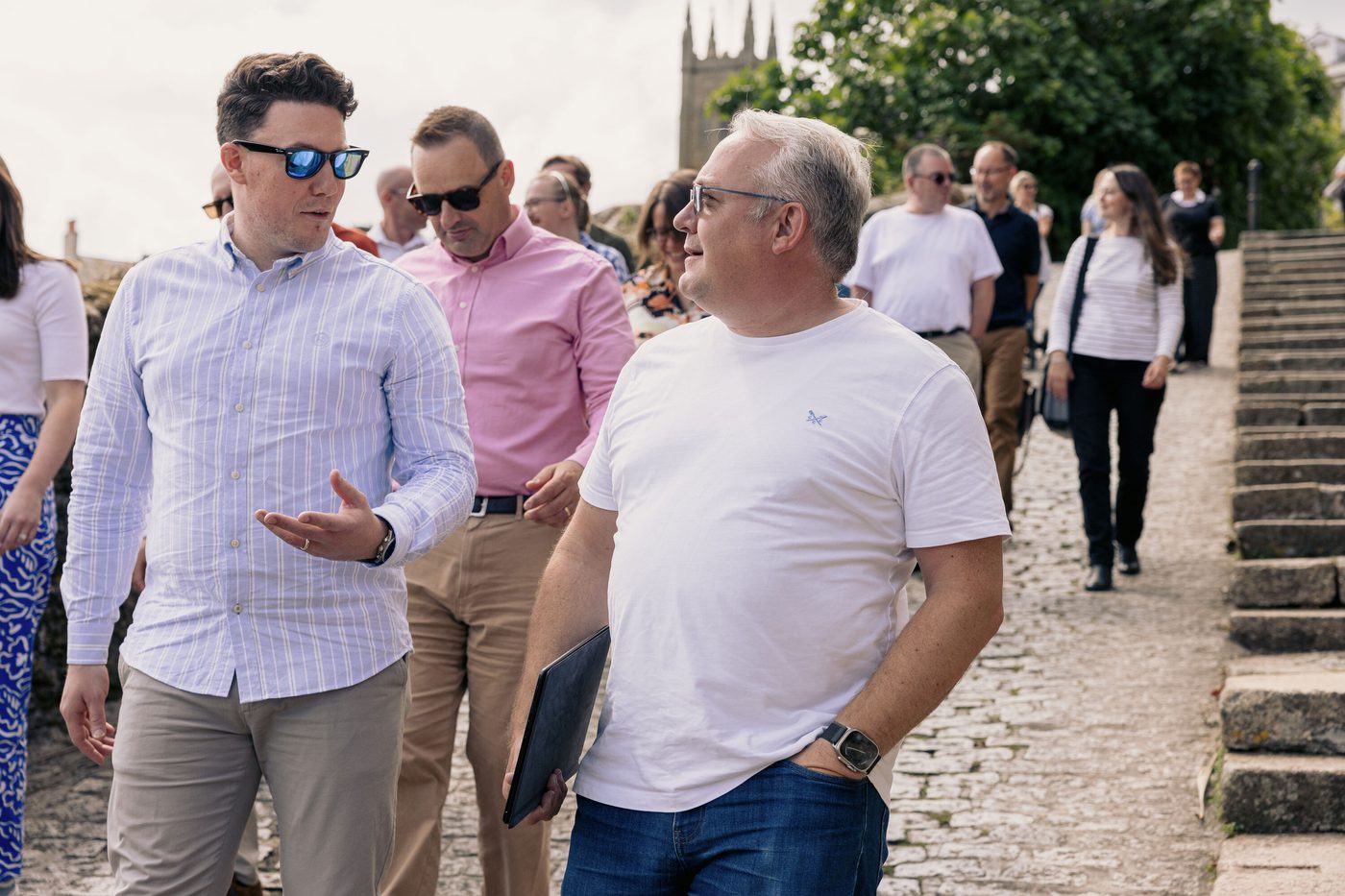
Initially, the Senior Leadership Team (that’s Sharon Bray, Practice Manager; Chas Cox, Director; and me, Pete Matthew, CEO) met with the good people of Nixon, but we didn’t want the new brand just to come from us.
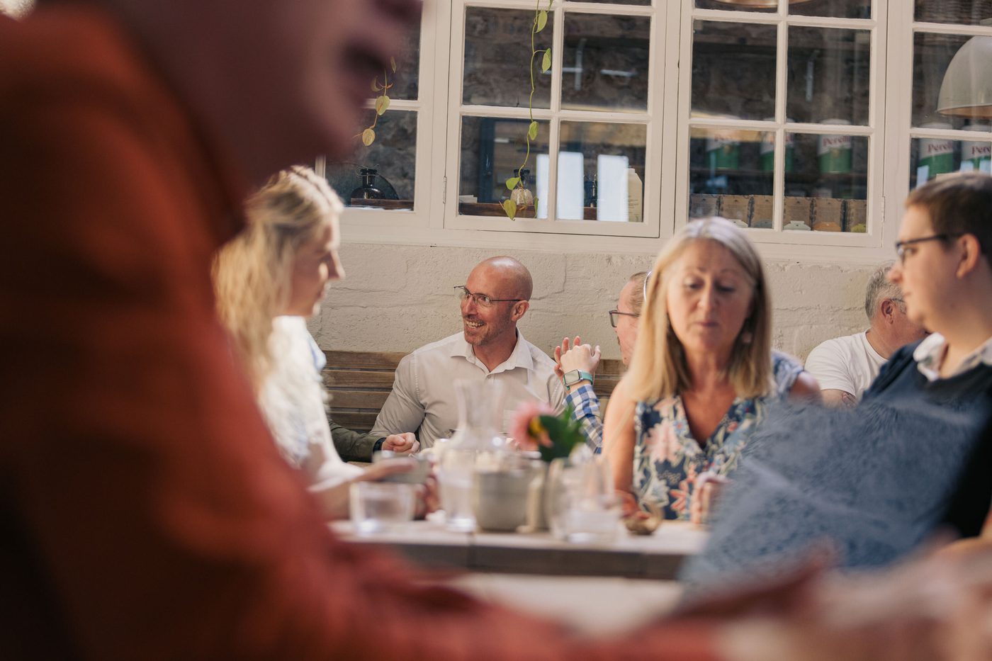
So a week later we closed the office and sent the entire team – minus the SLT – to the Nixon studio where they were plied with tea and biscuits while being grilled about what we do, why we do it and what it’s like to be a part of the Jacksons team.
From these discussions, Nixon created a brand personality and tone of voice, doing an amazing job of encapsulating us in words. We changed hardly any of what they came up with because, it turned out, the entire team was on the same page!
What’s in a name?
One vital question was: should we keep the Jacksons name or not?
Jacksons has been in Penzance in one form or another since 1923. While much of our work is done with clients out-of-county now thanks to video calls and secure online portals, it seemed crazy to turn our back on so much history.
We wanted to be different, but not at the expense of destroying our local brand and confusing existing clients.
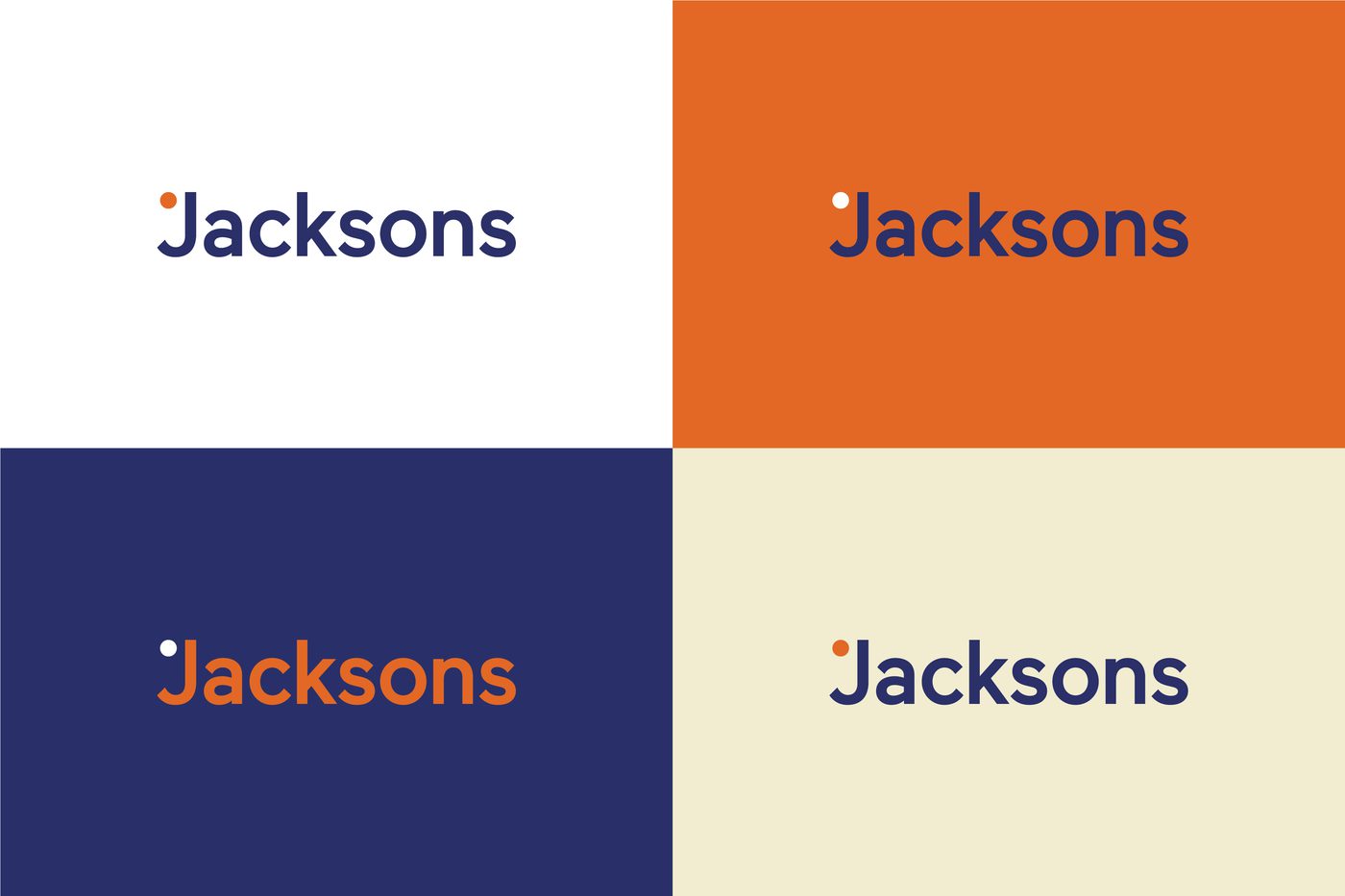
So we kept the name Jacksons, but dropped the Wealth Management because we felt that this no longer reflected what we do. We’re financial planners, but we’re far more interested in people than their money, and calling ourselves wealth managers just didn’t cut the mustard any more.
We also wanted to create a subtle link with Meaningful Money, my online financial education platform, comprising of a podcast, YouTube channel, book and online community.
So now, we’re just Jacksons, but our tagline is Meaningful Financial Planning – see what we did there?!
The branding
There’s no denying that the most fun part of any branding exercise is the visuals, and the team at Nixon created three options for us to choose from.
Each option had merit and had a clear message behind it. One was Balance, and the branding had a calming vibe, which we liked, but also could have worked well if we were a spa and wellness centre, which we’re not.
Another was Growth – all investors like the sound of that, and it also reflected our desire to nurture our clients and our team to higher things. The colour scheme reminded us of a certain high-street bank, and a few of us used to work there, which led to a visceral reaction against this branding option!
The clear winner was a branding based on People, and the finished version is what you see here.
Jemoji
The team were very quick to latch on the ‘J’ in Jacksons looking a bit like a face. From here came Jemoji, our own little brand mascot. You’ll see more of Jemoji as we go along, I’m sure.
There’s even talk of Jemoji branded hats, t-shirts, socks, umbrellas, coffee cups. Maybe we’ll add a merch shop to the website in due course!

People, not money
We’re delighted with what the Nixon brand geniuses have come up with. We feel it reflects our personality – this is a warm, caring place to work, with a bit of a quirky side, too.
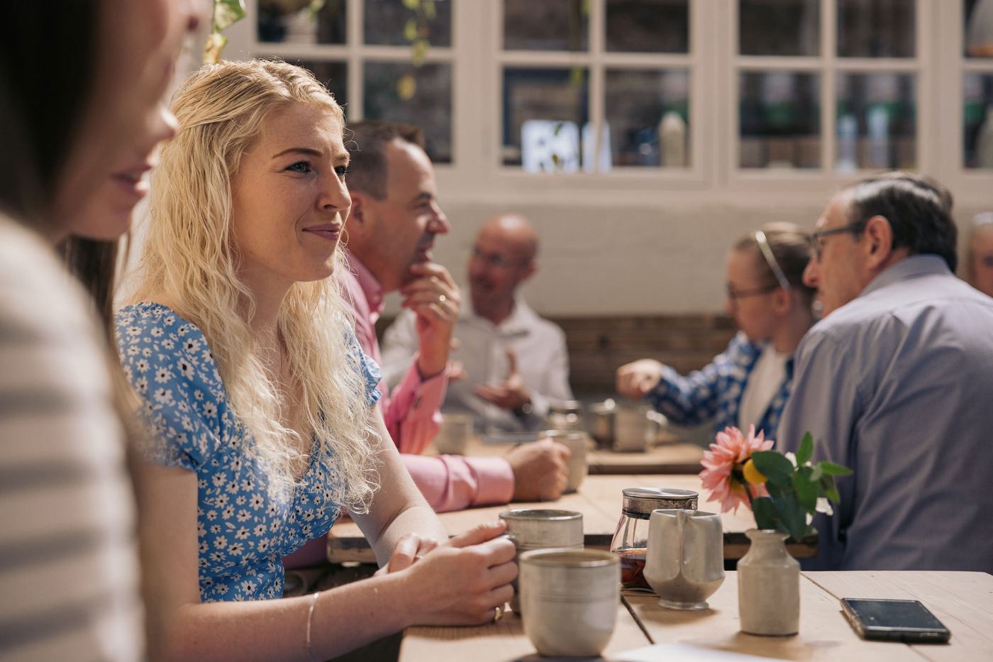
The branding and the website celebrate real people. We are a diverse team from all kinds of backgrounds, and our clients are too. We wanted to reflect that while avoiding the kind of predictable stock imagery we see all the time.
Even our team photos are candid and happy, with lots of smiles, laughs and daft faces, because that’s real life. We all actually get on, which we think comes across.
We believe passionately that money is merely an enabler; it’s a means to an end, not an end in itself. Our clients want to live fulfilled lives and don’t want the money to get in the way of that. We help them to do just that, and we reckon the new look reflects that really well.
We hope you agree that the new brand is fresh, clean, modern and reflects our personality and motivation. If you haven’t worked with us yet, then when you do, we know you’ll feel the vibe of the brand in each member of the team you meet.